A mini-memoir in gathered books
This is a description of some books. They are all “first editions,” which I suppose makes them “collectible.” Not very, though; these books are part of a working library, research material accumulated for essays in printing history. So, this is a kind of memoir in gathered books. Some are about limited-edition, small-press printing, some about producing little literary magazines, and all are about ways to combine those things. It’s a bunch of stories. From the hedgerows of the literary.
Oliver Jenkins, Open Shutters
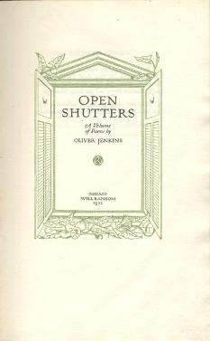 If I had the money, I know what I’d buy. Elsa Gidlow’s On a Grey Thread lists for eight or nine hundred dollars on the used book market. I’d buy that. I’d be buying the book, not its contents, which are poems, gay poems in fact. In 1923, On a Grey Thread was the first book of openly lesbian love poetry produced in the USA. That’s interesting and it accounts for the price of its first edition, but it’s not why I want it. Will Ransom printed and published Grey Thread, and I’ve gathered several of Will Ransom books. Ransom was a Chicago printer who, in 1922, launched a seven-book “Series of First Volumes.” Ransom’s idea was to produce limited editions of the first efforts of worthy but bookless authors. Gidlow’s Grey Thread was No. 6 on his list. The first title of the series was Oliver Jenkins’s Open Shutters. It, like others in the Series of First Volumes, is well-designed and crafted: green ink on Whatman paper. I bought Jenkins’s Open Shutters for $40, and the rest of the series is comparably priced. Ransom wanted his craft presswork to launch authorial careers. “Believing that we are even now in the beginning of a renascence of all the arts,” Ransom said, “my sympathy is primarily with the younger writers who are just coming into expression.” Ransom offered opportunity. “I am issuing a Series of First Volumes, each the initial publication of a new author,” he announced. “It is for these fresh voices, even more than for my own work, that I bespeak interest and patronage.” Through Harriet Monroe, editor of Poetry magazine and a fellow Chicagoan, he chased Wallace Stevens, but Stevens gave Harmonium to Knopf. I admire what Ransom tried. When Karen Donovan and I started Oat City Press, in 1985, we had something like it in mind. It didn’t work very well for Ransom, and it still doesn’t. Budding writers want regular books, books that stores will stock and that sit properly on their shelves, books that people will buy. Singular, hand-crafted “fine” printing is for when You’ve Made It. Jenkins was an okay poet. So were the others on Ransom’s list. Ransom himself is what’s interesting here. His Series matters.
Paragraph magazine and S4N
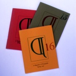
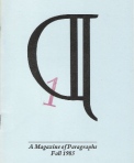 Oat City Press got started with a serial. In 1985, Karen and I invented a little magazine called Paragraph. (Actually, its name was the Della Robbia paraph symbol, which was cool; having to spell it out, as we soon learned we must do, was less cool.) I was, in 1985, a recently unemployed academic, and I was suddenly charmed by being able to read any damned thing I wanted.
  Dictionaries, encyclopedias, and how-to manuals—great stuff like that. Not to mention novels, mystery novels for god’s sake. Poems! Suddenly everything seemed like a story: the Sudanese navy, furze and its synonyms, Adelaide Crapsey’s cinquains. I began writing some of my own, little pieces I culled from my browsing. I called them “Great Tales from Reference Manuals.” Here’s one, on Cuttyhunk.
Coasting a new land in the spring of 1602, Bartholomew Gosnold and thirty-two companions discovered Martha’s Vineyard but decided to settle Cuttyhunk instead. By May 28 they had planted a garden and built a stockade. There were Indians. Twenty-two days after they arrived and given their choice, everyone boarded the boat back to England, ending the first of the New England colonies.
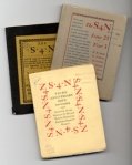 Then one day I discovered S4N. Frederick J. Hoffman talked about it in The Little Magazine: A History and a Bibliography. S4N was a tiny magazine produced by World War I–era Paris expatriates. It was smaller in size than Broom or Secession, but akin. The label “little magazine” usually refers to circulation figures, but S4N measured four inches by five, dimensions that made no obvious sense until electronic media began to shorten attention spans. In 1922, editor Norman Fitts’s S4N was a literary journal headed straight toward the twenty-first century. Fitts designed it and printed it, mixing shopfloor sweat with entrepreneurial energy.
  He embraced seriality in the arts, and he tried to transcend artistic subjectivity in ways that would harness the centrifugal interests of his writers. He wanted S4N to be an art form of its own. Editor Fitts was ahead of his time. By the end of the twentieth century, writers of flash fiction and other forms of short prose produced a literature that might have fit S4N. Electronic publishing and MTV lay far in the future. The magazine’s true innovation, its size, awaited a postmodern aesthetic of brevity. In the mid-1980s, S4N seemed like an available model, a useable past.
Providence Local no. 33, ITU, Printers and Printing in Providence, 1762–1907
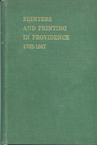 I live in Rhode Island. Providence has a robust printing history. For instance, in 1889 the Providence Journal was the first New England newspaper to install the revolutionary Mergenthaler Linotype slugcasting machine. The Projo put a dozen of them on the third floor of the recently acquired Fletcher building, downtown. Then, in 1907, Providence’s Local no. 33 of the International Typographical Union published a celebratory account of the city’s printing history. They called it Printers and Printing in Providence, 1762–1907. There’s a lot of information on printing establishments in the book, but the great thing about it is its annotated list of the hundreds of journeymen printers who worked in the city. The small biographies are a third of the book.
So, Printers and Printing in Providence is a rich resource for printing historians. Still, history is all about point of view, isn’t it? The staunch unionists who produced their book left out their city’s particular gift to printing: Daniel Berkeley Updike. Updike grew up in Providence. He established his Merrymount Press, famous in its day, in Boston. That’s where he learned to print as he designed advertising for Henry Houghton. Journeymen printers lived a world of their shopfloor, the Westminster Street union hall, and Doyle’s saloon. Updike didn’t. He bequeathed his printing library to Providence’s public library. It’s a terrific source for printing historians.
Ramon Guthrie, Trobar Clus; Norman Fitts, S4N
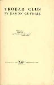 In January 1924, Norman Fitts and his friend Ramon Guthrie published Trobar Clus. It was a book of poetry—one of two published by the short-lived S4N Society of Northampton, Massachusetts. Guthrie wrote it; Fitts did the illustrations. Fitts directed the society, too, and edited its magazine, also called S4N. He wanted “to promote an open-minded consideration of art by the printing of opposed viewpoints and reactive critiques.” Guthrie fit, in a late-Victorian, counterrevolutionary sort of way—about as well as did his book, the title of which referred to the stylized, intentionally difficult, and inordinately supercilious poetry of 14th-century Provence. According to the dust jacket, Guthrie was a philologist, “a doctor of law as a result of study at the universities of Toulouse and Paris,” a lecturer. He strolled up Green Street in dark colors and a scarf. He had flown a fighter in World War I, had downed four Boche. Guthrie’s poetry was the gai saber, a revival of the 14th-c
 entury effort to breathe life into the medieval romances of Provence—Bertran de Born, for instance. Mon dieu. Guthrie taught at Dartmouth and published his poems well into the second half of the twentieth century. But much less remains of Fitts or his S4N, although it published Hart Crane, E. E. Cummings, and Kenneth Burke. The name, Guthrie’s wife once claimed, derived from late copy submitted to printers, reminding them, at the spot marked “S4N,” to save space for the name of the magazine. And so they left it, an obscurity too hard to resist. And so, alas, it remains.
William Barnes, Joseph McCann, and Alexander Duguid, Fast Typesetting
Northampton in western Massachusetts is a literate place (the hometown of S4N magazine’s Norman Fitts among many others) and its Forbes Library is a good one. I was once a card-carrying patron of that library. Word had it that Melvil Dewey had roughed out an early version of his famous Dewey Decimal System for the Forbes. I was immediately charmed by this, but, alas, it turned out untrue. For one thing, the Forbes’s classification system isn’t a decimal system at all. Forbes’s books are organized according to the “Cutter Expansive Classification System,” a precursor to that of Dewey. Such plans were in the air. One Charles Ammi Cutter, Dewey’s contemporary and the librarian at Forbes from 1894 to 1903, invented it. Cutter’s system then gradually lost popularity to Dewey’s, and, especially in academic libraries, has been replaced by the Library of Congress system, which is similar to and derived from Cutter’s idea.
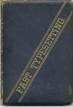 Rummaging the Forbes stacks one day, I found Howard Lockwood’s 1894 edition of the American Dictionary of Printing and Bookmaking. It’s a big, thick compendium—Cutter call number ZH11+5Am—and therein I found an entry for “fast typesetting.” Setting type was what I then did for a living, and I was pretty speedy at it, if I may say. But in those days I used a qwerty keyboard attached to a Compugraphic Editwriter 7500 phototypesetter. Lockwood’s nineteenth-century fast typesetters—printers called them “swifts”—did it by hand, letter by single letter. They were staggeringly fast, and they raced at it. Of course they did, when you think about it—first for beer, then for money—but who knew? Lockwood’s dictionary entry was about typesetting races. By the mid-1880s, a racing circuit resembling that of professional golfing today had spread throughout the eastern United States. Lockwood’s book told me of forgotten stars of the printing trades, journeymen named Barnes, McCann, and Alexander Duguid, each in turn a national champion. In 1886, the three collaborated on a book about typeracing. They called it, aptly, Fast Typesetting. It’s as important to me as any book I’ve ever read. In 2003, I wrote my own book about those men. I called it The Swifts: Printers in the Age of Typesetting Races.
Harpel’s Typograph
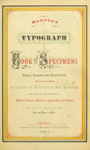 The Providence (Rhode Island) Public Library, generally splendid, contains a terrific rare book room. Lots of whaling stuff there, but its books and materials on printing history are exceptional. This is importantly because Daniel Berkeley Updike, long the proprietor of Boston’s Merrymount Press but a native of Providence, gave his personal collection to his hometown library. The Updike Ephemera Collection includes a copy of Harpel’s Typograph, a classic in American printing literature.
Oscar Harpel was a Cincinnati printer, a prosaic vocation in the mid-nineteenth century, a trade. Printers, however, thought theirs was the prince of such trades. In fact, because literacy defined the occupation, “smart” printers constituted a working class “aristocracy.”
Oscar Harpel thought printing, esteemed as it was among the trades, lacked a requisite glamor, not enough bright lights. So, he advertised. In 1870, he designed, printed, and published the Typograph. It was a type specimen book and a printing manual, latest in a long line of these and standard to the trade. The Typograph, however, seemed startlingly different. Its embellishments, typography, and especially its colors created a fresh, innovative appearance. Oscar’s book was an advertisement for itself, for the Harpel printing firm, but Harpel had created a look that soon defined a style. The trade called it “artistic printing.”
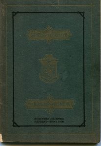 Remarkably, Harpel’s Typograph was the product of humble job printing. Oscar Harpel offered imaginative graphics as a component of workaday printing’s composition service. A generation before Bruce Rogers took typographical design off the shopfloor and into the studio and fifty years before William Addison Dwiggins gave it a name, Oscar Harpel had “invented” graphic design.
Oscar lacked fame and fortune, and so do I. A copy of Harpel’s Typograph costs money, so I settled for an abbreviated 1930 facsimile that, strangely enough, is even rarer. Salt Lake City’s Porte Publishing Company used it to advertise its own work, invoking favorable comparisons with its predecessor. It’s a 56-page booklet, the second volume and sixth number of Business Printer, a “little magazine of selling and production ideas.”
Henry Van Dyke, The Poetry of the Psalms
 In 1992, I moved to Rhode Island, to Providence. Karen came, too. Actually, she was already home; KD grew up in Rhody. I, however, was full grown before Rhode Island was much other than hearsay. Three things happened: Oat City Press got a permanent address, I discovered the Providence Public Library, and in that library I found the Berkeley Updike History of Printing Collection.
 D. B. Updike, Providence’s native son, became a printer in spite of himself. There had been “layout men” and there had been Oscar Harpel, but few before Updike came to printing through graphic arts and design, rather than a trade apprenticeship. At first, Updike designed ads for the publisher Houghton Mifflin, and in the early 1890s he opened his own Merrymount Press. In time, Merrymount became the printer to Edith Wharton, which boosted business considerably, but originally Updike was a liturgical printer. In 1891 he produced On the Dedications of American Churches and subsequently the Episcopal Altar Book of 1896.
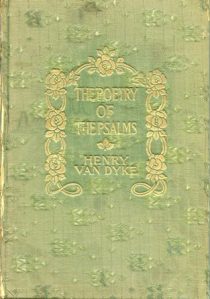
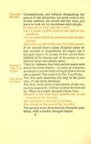
He also printed for Henry Van Dyke, who in the years following Henry Ward Beecher, was the most famous Protestant clergyman in America. It happened this way. The Episcopal Altar Book established a Merrymount Press reputation, and Berkeley Updike quickly became an authority on liturgical printing. Updike then built upon that rising reputation, partly by composing and printing a series of Van Dyke’s sermons and essays. Crowell subsequently published these—notably The Poetry of the Psalms—as small books. Van Dyke’s Poetry of the Psalms (1900) applied Updike’s manner of liturgical rubrication to poetry. The result remains an intriguing crossover.
Elbert Hubbard, Little Journey to George Eliot
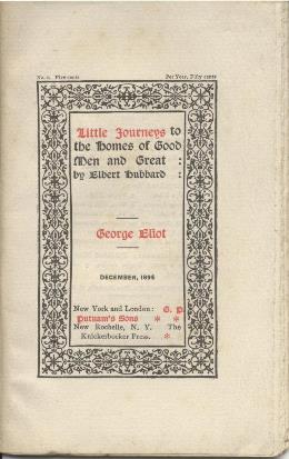 The Providence Athenaeum is a splendid old library on the city’s venerable East Side. The Athenaeum’s rare book room contains a nice collection of Roycrofters books printed by the its founder, Elbert Hubbard. In 1895, Hubbard’s first Roycroft publication was a “little journey” to the home of George Eliot. It was a small item, a booklet really, and similar in both concept and size to Oat City Press publications. I was charmed, as much by the shape of Hubbard’s printing ambitions as by his product.
In 1895, Elbert Hubbard abandoned a life of selling soap and founded an arts colony—the Roycrofters of East Aurora, New York. Hubbard then proceeded to become one of America’s fabulous characters, like Ben Franklin or Will Rogers or Steve Jobs. Unlike others, however, his claim to fame was purely literary. Before Roycroft became (and remains) a mail-order purveyor of Arts and Crafts–era consumer goods, it was a printing shop and a publisher. And the first thing Hubbard produced was a series of twelve small booklets, pocket-sized little magazine-type affairs, measuring 4¼ by 6¾ inches. The project bore a kinship with Norman Fitts’s 1920s S4N magazine and, lo, Oat City’s Paragraph.
In December 1895, Roycroft begot the inaugural issue of the serial “Little Journeys to the Homes of Good Men and Great.” Hubbard’s opening subject, almost random, was George Eliot. Although each of the dozen original subjects was produced singly, the Little Journeys project was a serial from the start. The volumes were never stand-alone books. The twelve Journeys in that original series were issued monthly, beginning with the English novelist George Eliot and including visits to Carlyle, Ruskin, W. E. Gladstone, J. M. W. Turner, Swift, Victor Hugo, Wordsworth, Makepeace Thackeray, Dickens, Oliver Goldsmith, and Shakespeare.
Elbert Hubbard rarely touched the content of George Eliot’s work. He took art and idea for granted. Instead, Hubbard situates Eliot in her locale and interacts with that setting. He visits; he drops by. In fact, the best part of the Eliot piece is an exchange with Jeemes, the butler, done in dialect.
“We’ave many wisiters, sir; a great bother, sir; still, I always knows a gentleman when I sees one. P’r’aps you would like to see the ’ouse, too, sir.”
Jeemes is angling for a bribe, and Hubbard happily complies. The moves here are complex. The astute Hubbard is generous to those beneath him. Jeemes, the butler, has recognized the gentleman in Hubbard, only yesterday a soap-selling Buffalonian. The worldly Hubbard knows the ways of master-servant relations. He knows when he’s being conned. He knows everything worth knowing, enough to put aside Eliot’s prose. Instead, he spends a couple of pages reckoning with Eliot’s horse-like face.
“But that is better than to have the face of any other animal of which I know,” muses Hubbard. A riff. “Surely one would not want to look like a dog!” Shakespeare “hated dogs.”
What?
J. Ben Lieberman, Printing as a Hobby
Jethro K. Lieberman, Fifty Years a Typesetter
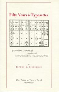 A few years ago, Jethro K. Lieberman, a law professor, distributed copies of Fifty Years a Typesetter, a memoir recounting “adventures in printing together with some meditations on theory and craft.” It’s a nice little booklet, especially interesting about the life and work of Lieberman’s father. That father was J. Ben Lieberman, a printer by trade. His son Jethro’s “fifty years” is mainly family time, not printing time.
Ben Lieberman recognized the obsolescence of commercial letterpress printing and, fearing the worst, he embarked on a one-man outreach program to save an ancient craft. Beginning with his 1960s book, Printing as a Hobby, Lieberman became a missionary for what he considered a dying occupation. It was a potent ministry.
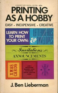 Our land now teems with artisan printers, I among them. Thanks partly to Lieberman, letterpress craft printing staged a rampaging revival. Its ubiquity, in fact, makes Lieberman seem less cause than symptom. His printing advices, of course, joined an instructional parade. From Joseph Moxon’s 1694 Mechanick Exercises through Harpel’s Typograph (1870), trade manuals were a staple shopfloor literature. By the end of the nineteenth century, they described such shopkeeping as it perched at the edge of growing industrialization. In Lieberman’s mid-twentieth century, village printing offices had become big-city factories. Lieberman understood that craft printing’s hand-set type and relief impressions were becoming avocational, pastimes all the more valuable for being outmoded and more importantly, impractical. He wrote a little book to help us do it. And he didn’t stop there. Memory being essential in sustaining old-fashioned skills, Lieberman helped found the American Printing History Association. Fittingly, the society’s annual lecture bears his name.
Gary Metras, Adastra Press: Merritt Clifton, From an Age of Cars
Ed Rayher, Swamp Press: Dusk Lingers: Haiku of Issa
 Inspiration Department: For a lot of years, Oat City Press shared a history with a couple of terrific private presses. Gary Metras and Ed Rayher prowl the lit-rich Pioneer Valley of western Massachusetts. Metras has printed and published as Adastra Press out of an Easthampton garage since the 1970s. Merritt Clifton’s From an Age of Cars (1980) is a splendid very early specimen.
 Ed Rayher operates Swamp Press, lately out of Northfield, Mass. He’s a fine printer and an equipment junkie. How many people do you know who own and operate a Thompson Typecaster, a Benton Pantograph? He’s also a Monotype type foundry. Rayher, like Metras, started in the 1970s. Here’s an early Swamp Press title. It’s Dusk Lingers: Haiku of Issa (1981) illustrated by Hide Oshiro and translated by Dennis Maloney.
Genevieve Taggard, Circumference, Varieties of Metaphysical Verse 1456-1928
I got interested in the Chicago printer Will Ransom, a really important guy among small press printers. As I researched Ransom, another Chicagoan, a publisher named Pascal Covici, kept turning up. I learned that Covici left Chicago for New York in the late 1920s and with Donald Friede became Covici-Friede Publishers. The men were eager to promote innovative writers, poets such as E. E. Cummings, and to do this they needed a skilled and careful printer. The fellow they found was Samuel A. Jacobs. Soon, as far as I was concerned, Jacobs and his Golden Eagle Press became much more interesting than either Covici or Friede.
Samuel A. Jacobs was E. E. Cummings’s “personal printer.” From 1923 and Cummings’s first book, Tulips and Chimneys, to No Thanks, of 1935, Jacobs composed all of Cummings’s poetry and printed much of it. The work was visually innovative on the page, difficult to read. Mainstream America considered Cummings a vulgarian. Hip modernists did too, but they meant to praise. In 1923, the little magazine S4N called Cummings “the vulgarest of the newer younger generation”—pleasant thought—“and besides, a knockout of a person.”
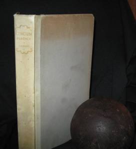 Sam Jacobs also appreciated Cummings, but not because he was uncouth. Jacobs thought Cummings was spiritual, a romantic. In November 1928, Covici-Friede hired Jacobs to collaborate with Genevieve Taggard, a Greenwich Village poet, on a book they would call Circumference, Varieties of Metaphysical Verse 1456-1928. In it, Jacobs and Taggard placed Cummings within a Western poetic tradition that began with Dunbar, Byrd, and Sir Walter Raleigh, passed through John Donne and Emily Dickinson, and arrived at Cummings, alongside Adelaide Crapsey, Malcolm Cowley, and Hart Crane.
Jacobs’s design work on Circumference drew praise, but the book also established his reputation as a scholar of classic metaphysical verse. Taggard was the titular editor of Circumference, but Jacobs was Taggard’s editorial and research director. He set the book in type and printed it; Jacobs was Covici-Friede’s production manager.
Golden Eagle peaked in industry esteem in the 1940s, and when typographic modernism became mainstream, Jacobs happily reverted to the Circumference-style printing aesthetic he favored, exquisite renditions of classic metaphysical verse.
Andrew Lang, The Song-Story of Aucassin and Nicolete
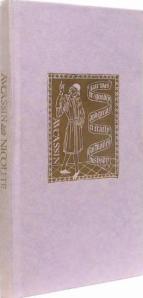 Not long ago, I had never heard of S. A. Jacobs or his Golden Eagle Press. Neither man nor press is ever mentioned in histories of printing. Once alert to Jacobs, though, I “reclaimed” him for two reasons. First, Jacobs printed for several famous modernists—E. E. Cummings, Eugene O’Neil, Marianne Moore. Then in the 1940s, Golden Eagle produced a series of diminutive, limited-edition poetry books. It was the sort of project that interested me. In particular, one of those Golden Eagle titles, The Song-Story of Aucassin and Nicolete, linked Jacobs with the noted type designer William Addison Dwiggins in a way that seemed strangely overlooked.
The 1946 Golden Eagle Press edition of Aucassin and Nicolete was Andrew Lang’s version of an anonymous twelfth- or thirteenth-century French chantefable or “sung story.” It’s a printing warhorse. S. A. Jacobs used a Mergenthaler Linotype font called Charter in printing the book. It was the first and proved to be the only use of that typeface, which makes Golden Eagle’s version of Aucassin and Nicolete more interesting than many.
The typographer William Addison Dwiggins designed Charter in the late 1930s for Linotype. As of 1946, it remained “experimental,” without license and commercially unavailable. Jacobs, however, reached a private agreement with Dwiggins for its use. In return for Dwiggins’s favor, Jacobs promised not to disclose Charter’s designer.
What was okay with WAD wasn’t good enough for Chauncey H. Griffith, head of typographic development at Mergenthaler Linotype. Jacobs had overstepped. Griffith accused him of profiting from unauthorized association with both Dwiggins and Mergenthaler, and he forbade further use of Dwiggins’s Charter. Linotype subsequently abandoned its Charter project. In 2006, Sibylle Hagmann revived it as Odile, for Kontour Type.
J. Cicott Cummings and S. A. Jacobs, The Higher Journalism
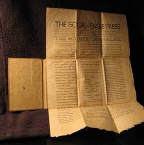 In 1936, Samuel A. Jacobs’s Golden Eagle Press published a tiny, anomalous bit of literary highjinks titled The Higher Journalism. It was a newspaper parody—think today’s Onion—a facsimile front page with a lead story and adjoining commentaries ascribed to Amy Lowell, Eugene O’Neill, E. E. Cummings, G. K. Chesterton, and F. Scott Fitzgerald, each written in the manner of their prose. Jacobs printed an 8½×13-inch single page, folded it four times, and bound it into 3×4¾-inch boards. The featured article of The Higher Journalism was a newswire piece transcribed by “J. Cicott Cummings.”
The “story” was inapt. The Cuban student Ignacio Gonzales, secretly heir to $5 million but ditched by his girlfriend, has shot himself. The literati, “re-write” crew, took it from there. Each of the “contributors” to the Golden Eagle Higher Journalism was famous. All, that is, except J. Cicott Cummings, who was unidentified. And lost he has stayed, as S. A. Jacobs and the reputation of his Golden Eagle Press, once prominent, faded. In 1936, the year of The Higher Journalism, Jacobs’s typography and book designs were widely admired and repeatedly honored. Throughout the 1920s, Jacobs built a reputation among the poets and fiction writers of high-bohemian Greenwich Village. Jacobs was a favored printer of early literary modernists, first at Polytype Press on West 8th Street in Manhattan and subsequently at Golden Eagle in suburban Mt. Vernon. He famously handled the poetry and prose of E. E. Cummings. Cummings called Jacobs, who was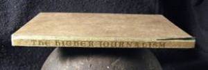 Assyrian by birth, his personal “Persian typesetter.” Might J. Cicott Cummings, the mystery lead “author” of The Higher Journalism, be the famous E. E. Cummings, in disguise? Cummings scholars don’t claim him. Ah, therein lies a tale.


